
Every writer starts with their name. Here you'll see the alphabet, your name in it and the three basic forms from tag to piece.
1 The alphabet and your name
The alphabet in Brush Gothic: gothic, painted with a brush in one stroke, rough edges. Upper and lower case look the same here, like in many tags.
More fonts from real handstyles, live with your name: to the gallery · all alphabets
Draw it yourself: five steps to a piece
2 Tag, Throw-up, Piece
Three levels, from fast to elaborate. Almost every writer goes through them in this order.
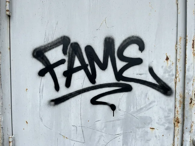 Tag
Your name as a signature, written fast in one stroke. Everything else builds on it.
Practice: in the blackbook, not on the wall.
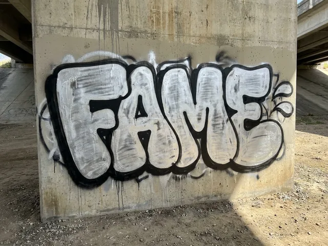 Throw-up
Fat, round letters with fill and outline, built for speed and visibility. Usually with a Fat Cap.
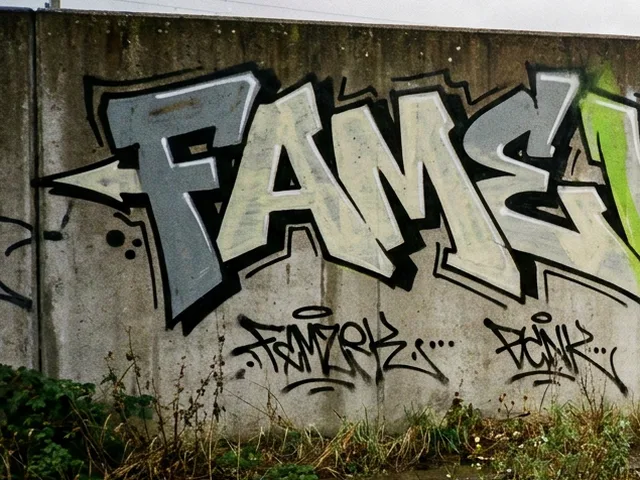 Piece
The worked-out picture, short for masterpiece: multicolored, with outline, background and often a character. Takes planning and time.
When letters are interlocked and only readable at second glance, that is called Wildstyle. Style Roots shows you where the styles come from.
All styles at a glance, from Bubble to Burner: Graffiti styles.
3 Lettering and calligraphy
Graffiti letters are lettering, just with a can, a marker and lots of imagination. That is why it pays to look at classic lettering.
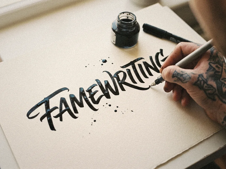 Calligraphy
The art of beautiful writing. Practicing line weight, rhythm and spacing also helps with tags and pieces. Many writers use a broad-nib pen or a brush pen for it.
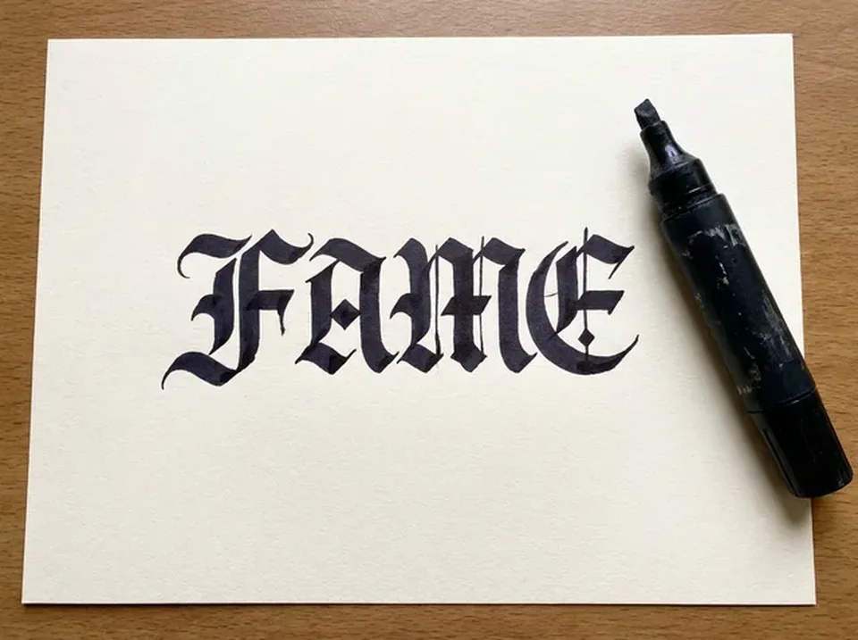 Gothic script
Pointed, angular letters (blackletter) often show up in graffiti, in tags as well as in pieces. They give letters weight and contrast.
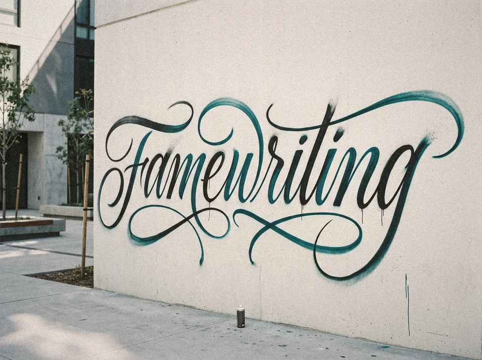 Calligraffiti
That is the name for the mix of calligraphy and graffiti: sweeping lines, big gestures, often with a brush or can on canvas or wall.
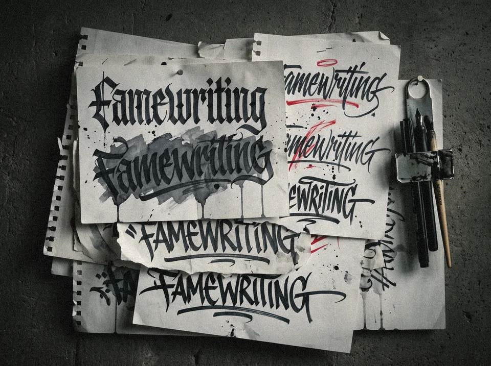 Chicano and street lettering
Chicano lettering comes from Mexican-American culture in California: Old English letters with fine hairlines and flourishes, known from tattoos and signs. Street lettering is rougher, with fast, hard strokes from marker and brush.
You find an introduction to handstyles and letterforms in the GraffWiki and at Style Roots. Practice in the blackbook first, then at legal walls.
Quick guide: which cap makes which line?
The cap is the nozzle on the can. It decides how thick your line gets. Beginners get pretty far with just a Skinny Cap and a Fat Cap.

Thin, precise spray. For outlines and details.

Wide, soft spray. For filling areas and big letters.

Extremely thin. For fine lines.
Which cans, Caps and markers you need to start: Supplies for beginners.
Legal graffiti only: practice in the blackbook or on walls with permission. How a wall gets on the map is explained on the walls page.
FAQ
What is the difference between a tag, a throw-up and a piece?
A tag is the quick signature, a throw-up a fast lettering in round shapes, a piece an elaborate picture with fill, 3D and details.
How do I see my name in the graffiti alphabet?
Type your name and the page sets it live in the Brush Gothic alphabet.
What is the best way to learn graffiti letters?
Start with simple shapes and practise in your blackbook. Step by step to your own piece is on the Draw graffiti page.